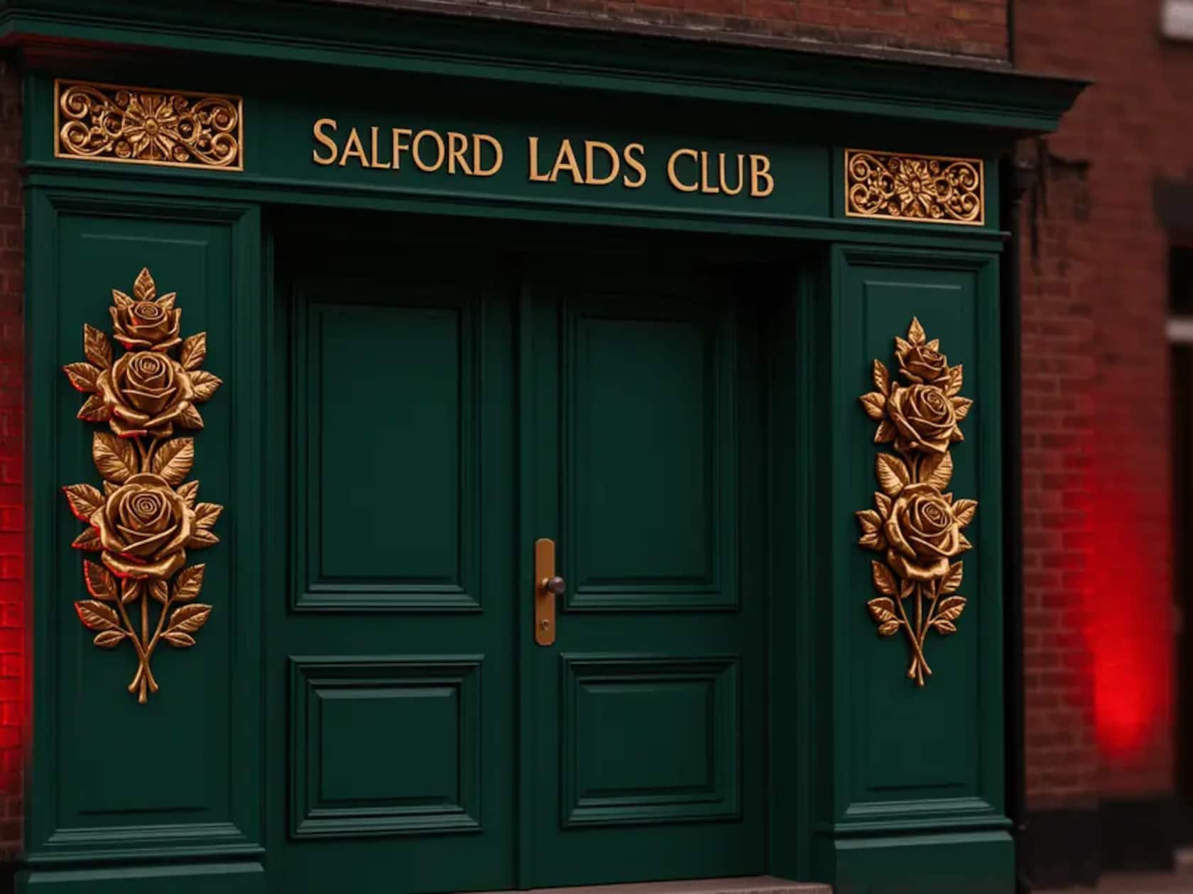
Manchester United’s 2026/27 third kit isn’t just another jersey—it’s a love letter to Salford, stitched together by a pop culture artifact that’s been drawing pilgrims for decades. According to reports from UtdDistrict and Footy Headlines, the design draws directly from the gold Lancashire roses that flank the entrance of Salford Lads Club, the Grade II listed youth center on Coronation Street that’s been a community anchor since 1903. And if those green-paneled doors look familiar, there’s a reason: they graced the inner sleeve of The Smiths’ 1986 album The Queen Is Dead, turning the building into an international landmark for music fans—many of whom, naturally, overlap with United’s global support base.
The club has not confirmed the design details yet, but the reported palette centers on those gold roses against the club’s signature green panels. The shirt is expected to launch in August 2026, rounding out a three-kit cycle that leans hard into local heritage. The home kit nods to 1970s United, the away revisits the late-80s royal blue adidas template, and this third offering reportedly digs deepest into Manchester’s geographic and cultural soil.
This isn’t United’s first rose-themed dance with adidas. The 2019/20 third kit used a tonal rose pattern on a dark base to mark 110 years since the 1909 FA Cup win—the club’s first major trophy—explicitly framing the Lancashire rose as foundational to early United identity. The 2023/24 home shirt went further, embedding a rose-inspired geometric pattern and a collar detail that adidas design director Inigo Turner said “evokes a great sense of pride in the people of Manchester.”
What makes this reported version different is its specificity. Salford Lads Club isn’t some abstract symbol—it’s a real place, a youth institution with a century-plus of community service, and its cultural footprint exploded after that Smiths’ album sleeve turned it into a destination. Fans online have already started matching the reported design to the actual club entrance, noting how closely the gold-on-green motif mirrors the original ironwork.
The shirt will carry the modern adidas Performance logo rather than the retro Trefoil used on the 2025/26 third, keeping it in line with the current on-pitch range. Full color and graphic details remain under wraps until the official unveiling, but retail reports peg the launch after the home shirt—already revealed—and alongside the away kit release. Whether United debut it in preseason friendlies or hold it for competitive matches is still unclear, but either way, the on-pitch reveal will show how the Salford Lads Club detailing translates to a matchday setting.
For a club whose commercial engine sometimes drowns out local ties, this reported approach feels notably considered. It’s a reminder that in a globalized sport, the most powerful stories are still the ones rooted in a specific street, a specific building, a specific gold rose.
Leave a Comment